Artist statement – summative assessment

Artist statement – summative assessment

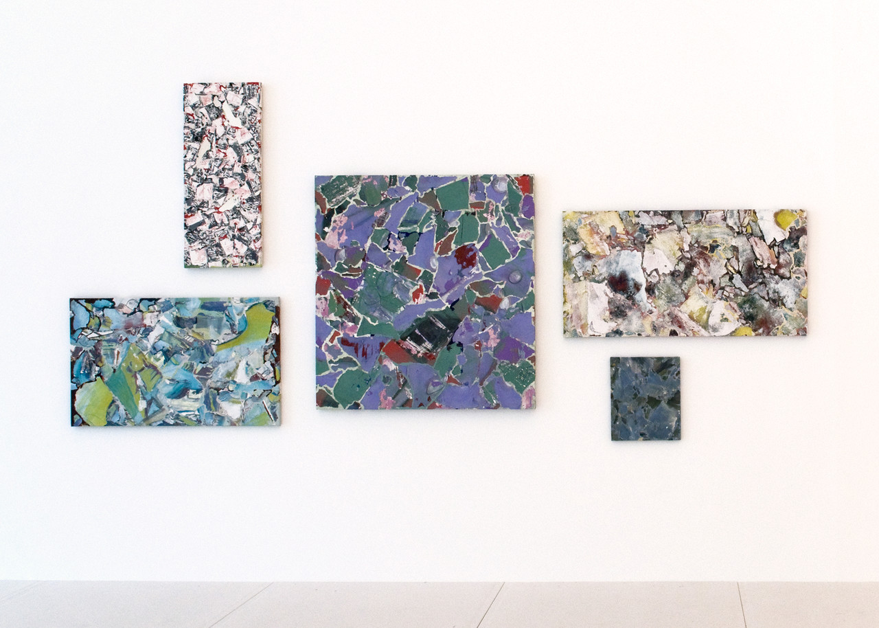
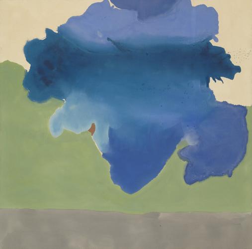
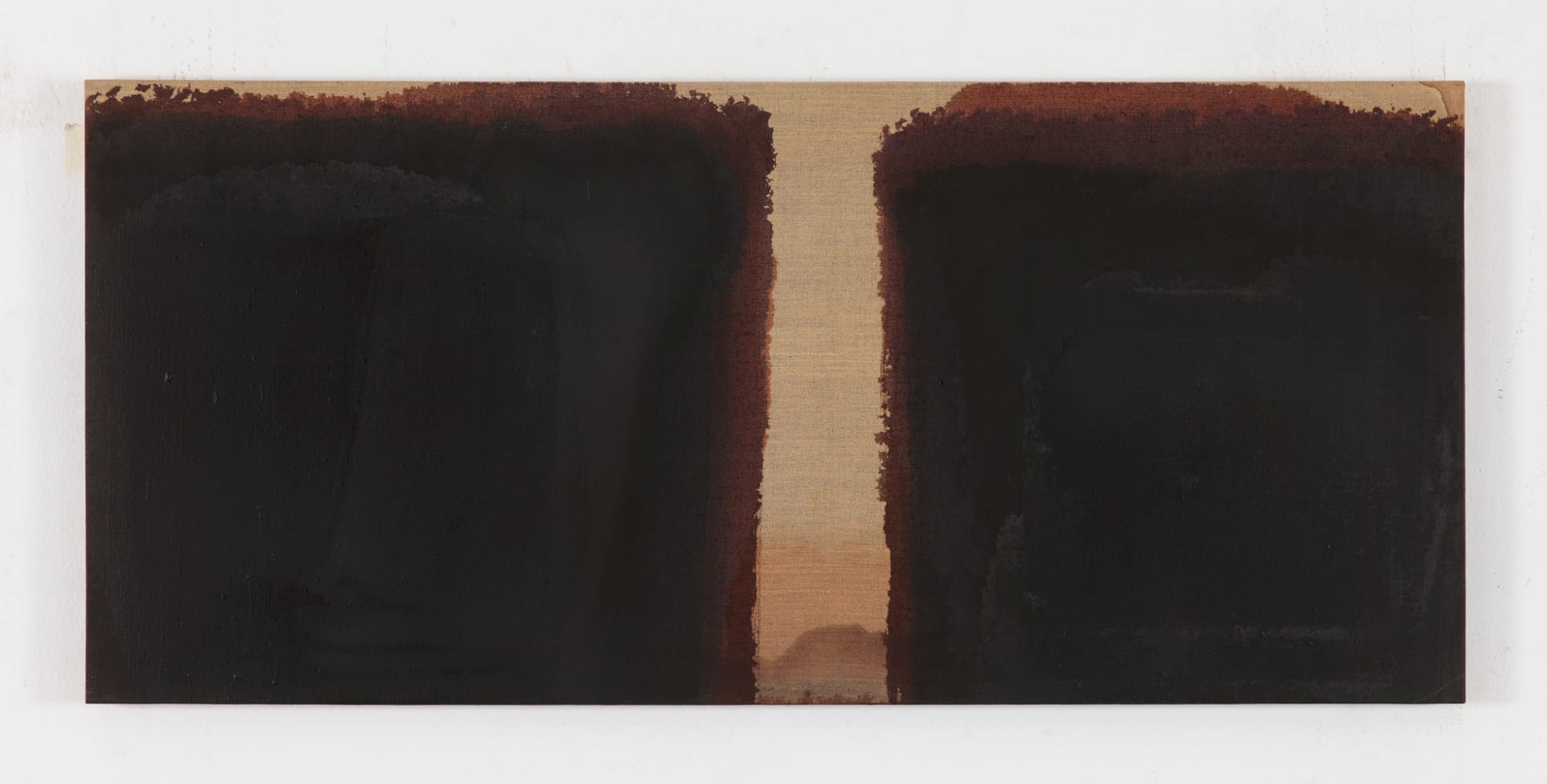
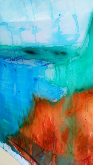
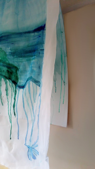
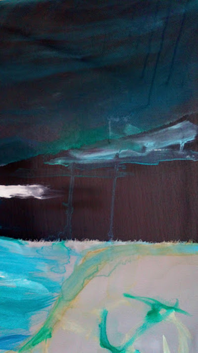
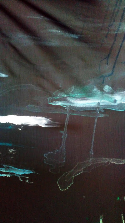
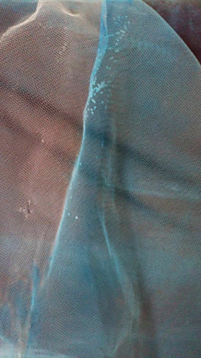
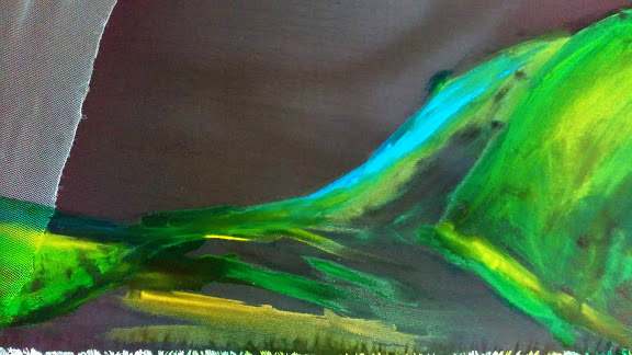
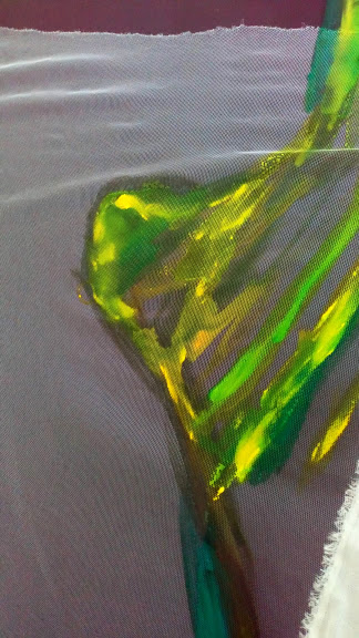
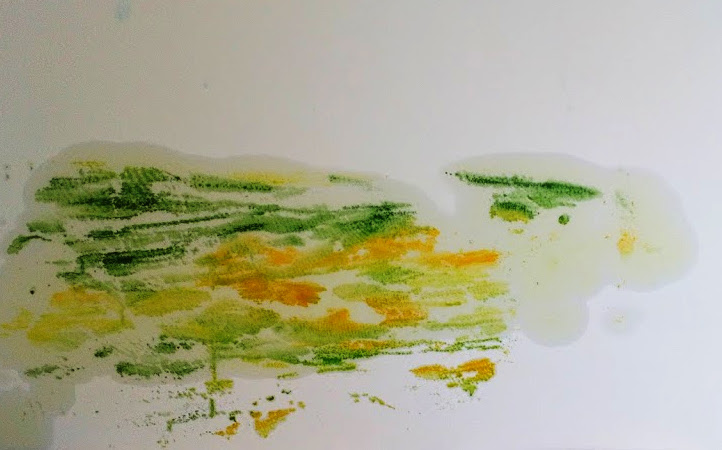
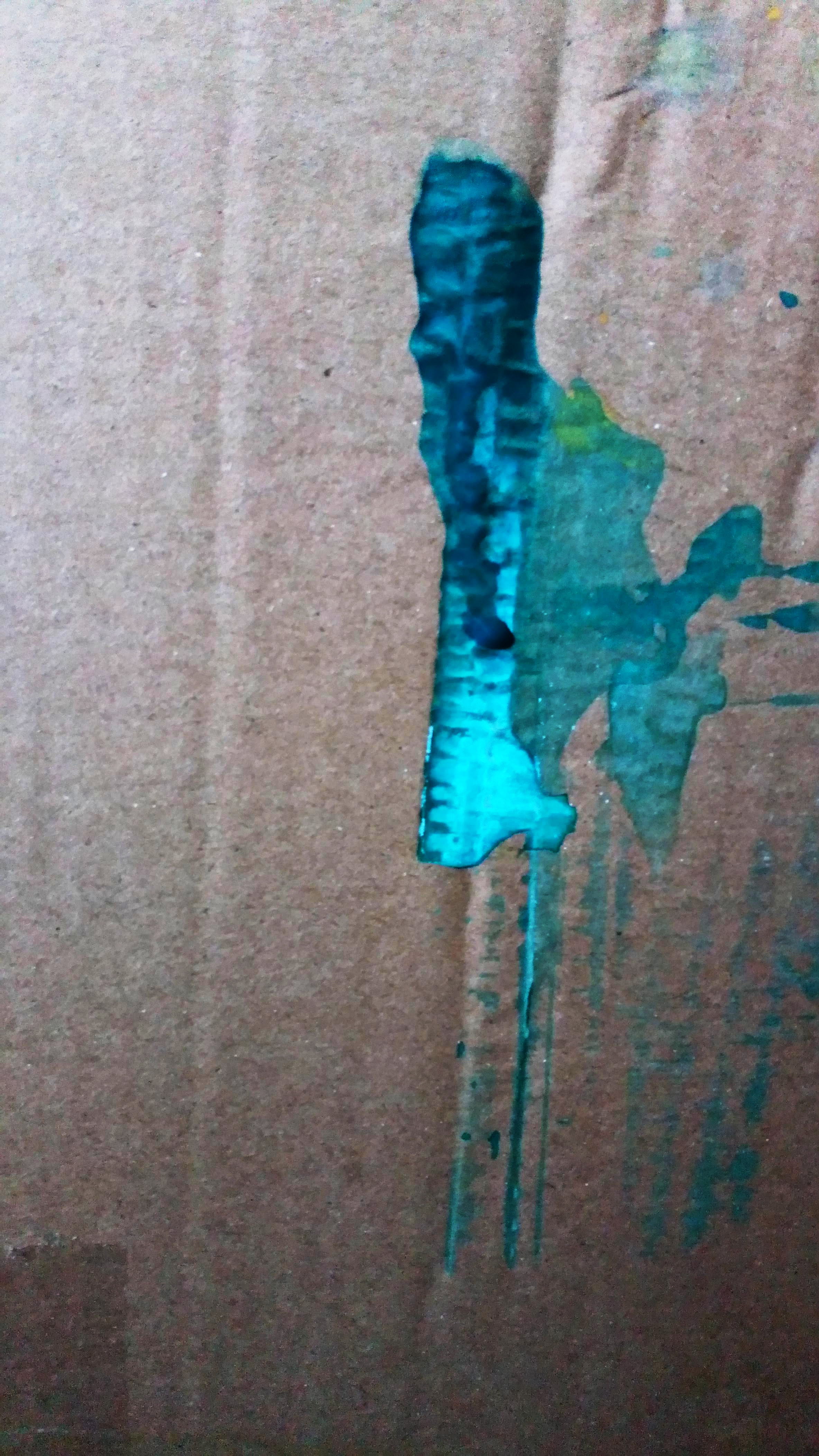
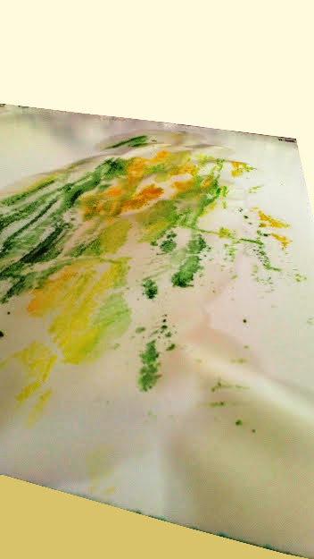
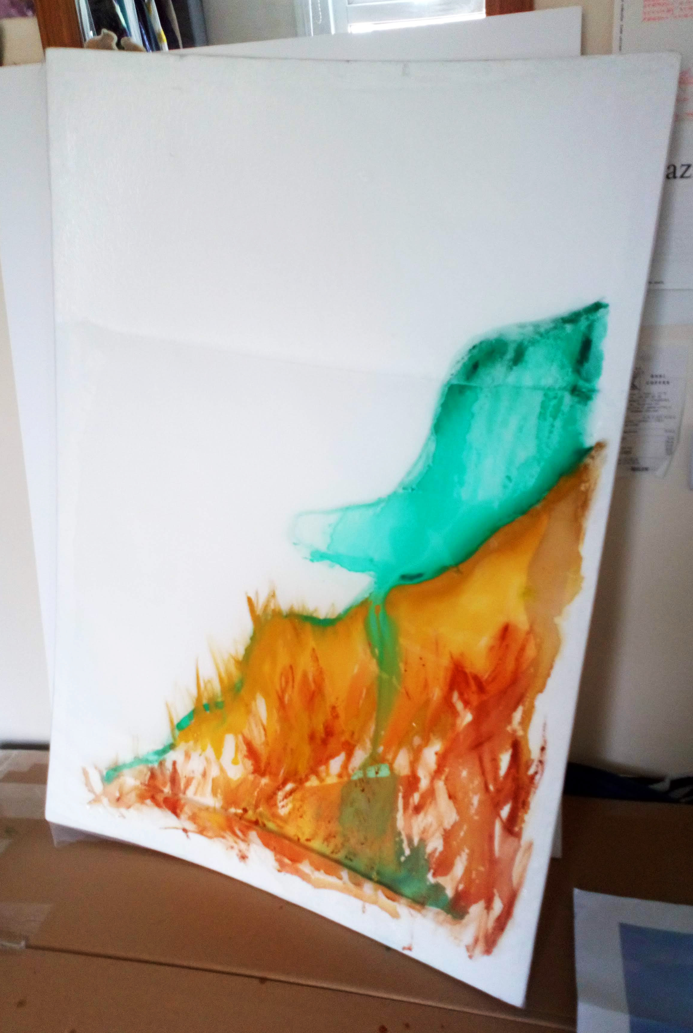
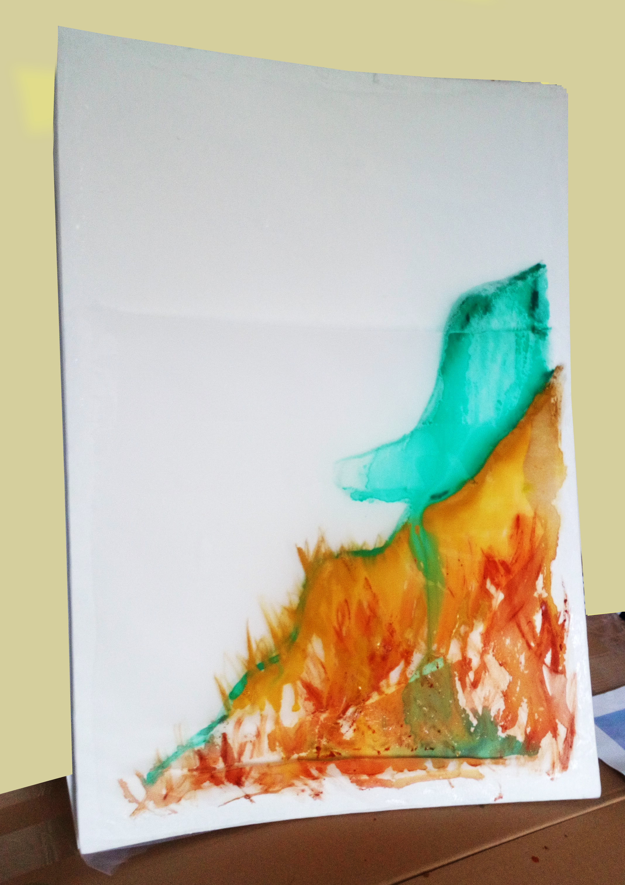
The series of paintings (Painting 1, Painting 2 and Painting 3) is a collection of artworks produced through experimentation and focusing on the process as well as materiality. All of the paintings share the methodological process of making the base and attaching the fabric. What differs is the order, amount, type and dimensions of fabric used. It is vivid that Painting 1 is representative of all the layers and the transitions between these layers. The fabric used is of unequal dimensions. Painting 2 was chosen to be only representing only of one of the three layers used as the artist finds the tulle layer to be the most effectively depicting the process of painting. There are marks emphasising the shape of the foam board and the subtleness and distinct painting shown on the tulle layer. Lastly, Painting 3 uses a black satin fabric as the base layer. The final outcome represented in the exhibition shows one of the layers and the transition is no longer vivid. Exhibition setting of the paintings aims to provide communication between Painting 1 and 2 as well as show contrast and versatility This is because Painting 3 represents a separate viewpoint of the singular patches of paint as somewhat of an ‘aftermath’ of a changing landscape.

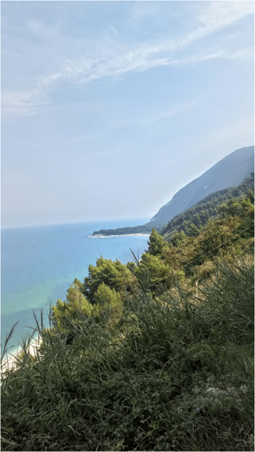
The absorbent quality of the fabric provides a fluid medium for the transition for the layers as the paint stains the fabric. The artist finds this representative of the changes to the landscape and the influence of the seascape on mindfulness. In addition, the artist works from own reference photographs, which are used to aid memory. The following methodologies of painting were used: constraining to three colours, which are either realistic or abstract in relation to the photograph and using colours depictive of emotion and/or memory of experienced particular to the seascape. Also,there are possible environmental messages in Painting 3 regarding the way in which the fabric hangs from the painting and that the base painting layer is left almost bare. It could be considered as a depiction of an abandoned and uncared for seascape.  

I’ve chosen to use layers to reflect on the topic of transition and translation that appears between the fabric. Methodology – an important part of the painting process is also in somewhat transitory stage, as it is neither abstract nor photorealistic. References of the works of Helen Frankenthaler and Yun Hyong – Keun have been impactful in the way in which the artist has approached mark making and staining the fabric. The process is mainly free-style and not planned in terms of the way in which the layers will look like. Much like Pavel Büchler’s work, the final pieces are a result of an on-going process of investigation of the materiality of the medium – fabric. The artist has considered the relativity of the material to the subject of the painting, despite the fact that it is a loose depiction of a seascape. This has been done through allowing the fabric to be stretched, folded and ripped. Painting 1 and 3 are good examples of the different ways in which the fabric has been represented to evoke the diverse qualities of the material and this refers to the work of Maya Deren.

Artist references/appropriation – Spring term 2020, Easter Break and Summer term 2020

Artist references/appropriation – Spring term 2020, Easter Break and Summer term 2020

WEEK 2 and 3: artist were suggested in the Viva presentation

Gerhard Richter – both abstract paintings and seaside paintings

https://www.tate.org.uk/art/artists/gerhard-richter-1841 https://www.mariangoodman.com/artists/59-gerhard-richter/

Abdallah (917-48), 2010, Lacquer under glass
(32 x 32 cm)

Richter’s abstract paintings show experimental process and it is vivid to me that the movement of the paint and textures created are the most significant features of the artwork. I think that I’d benefit from experimenting more with the way of painting – the process and the materials I use – perhaps I could use more unusual painting materials to create unique patterns.

Pavel Büchler: painitings washed down in a washing machine

https://www.artsy.net/artist/pavel-buchler https://tanyaleighton.com/artists/pavel-buechler

Under Construction (October 2010 – January 2011, Tinguely Museum, Basel)

Büchler’s work is most definitely relevant to my focus on the painting process in my art practice. The way the artist uses unconventional procedures as part of the creative process is very interesting and innovative to me and I’d like to explore the post-painting part of the process to further influence what I’d like to show as my final piece – still experimental.

WEEK 4: planning/sculpture

Both of these artists’ practices strongly focus on the shape and tautness within the shape. This is of high relevance to the curved shape of my foamboard bases for the paintings. The fabric provides a taut structure of to the base, although not professionally fixed onto the foamboard. Nonetheless, the idea is based on a sculptural making process, like represented in these works for example:

Naum Gabo, Linear Construction No.1 (1942-3)
Barbara Hepworth, Landscape Sculpture (1944-61)

WEEK 5: painting style, using free-style

Cy Twombly’s art practice is expressive and style free and this is in line with what direction I’m moving in terms of the way of painting.

Cy Twombly, Quattro Stagioni: Autunno (1993-5)

WEEK 6: Chosen blocking/wet on wet technique

Staining fabric; Helen Frankenthaler

image
Helen Frankenthaler, The Bay (1963), Acrylic on canvas (205 x 208 cm)
Yun Hyong – Keun, Burnt Umber and Ultramarine Blue (1991), oil on linen (45.3 x 99.8 cm)

I am intrigued by both of these artists as their paintings may seem simple at first. Both work in large scale and on absorbent mediums – linen and canvas as opposed to synthetic mediums or paper. I think that Frankenthaler‘s work frees mine approach of painting from a reference and motivates me to go towards more abstract direction, whilst keeping experimenting – I could experiment with acrylic next time, as opposed to using watercolours and oils interchangeably. Hyong-Keun‘s work is must more minimalistic and focuses on the technique and materiality and this is what I’d like to strongly focus when working with sheer layers of fabric.

The absorbent quality of the fabric provides a fluid transition for the layers of stains of paint, which I find representative of changes and transitions in my work in regards to the landscape and the influence of landscape on mindfulness.

WEEK 7:

Naum Gabo – stretching of the fabric + installation diagram

Polly Apfelbaum – installation; hanging fabric – scale too? – fabric on the wall rather stretched on a canvas

Cecily Brown – expressive/movement

WEEK 8:

Showing only the top layer and some parts of the process, what is visible – the process of manipulating the final version of the artwork >> Pavel Büchler

WEEK 9:

Tutorial artist suggestion: Maya Deren – black and white, flow of fabric similar to the flow and fluidity of water/waves

WEEK 10:

Flatter surfaces, small modifications – curves >> water/wave shapes/movement – Roni Horn – River Thames:

[no title] (1999), lithograph on paper

WEEK 11:

Emotionally related colours – constrainst in colour pallette and painting style:

EASTER BREAK:

Week 1 and Week 2: Memory based and emotional recollection based painter – Michael Armitage

Week 3: Ian Davenport – scale and painting process – pouring paint [pigments] and focusing on the materiality of paint/materials used [in my case – fabric]

Installation image from 'Horizons' at Dallas Contemporary, 2018
Ian Davenport, Horizons installation (2018)

Ann Hamilton – process, large-scale installations

https://art21.org/watch/extended-play/ann-hamilton-the-event-of-a-thread-short/

Summer term:

Week 1: Tina Jenkins – the visible layers in the painting – focusing on layers – the movement and folds of the materials – paitning as sculpture – expanded painting reference

https://www.saatchiart.com/art/Painting-The-Toll-Gate/164030/159374/view

Week 2: Expanded painting

Week 3: Display – contrasting work/using angles

Experimentation-Spring and Summer term – summative assessement

Experimentation-Spring and Summer term – summative assessement

“(…) engaged with experimentation through process,research and material investigation”

  • experiment through research of different artists: artists I have referenced to are relevant both to the structure of the painting and the process of painting
  • material experimentation/investigation: most of the experimentation was done aiming to see how the fabric interacts with the other layers and how different types of paint work on the fabric combinations
  • experimenting with display: in week 3 of the summer term, different displays were considered: considering angles, the different layers of the paintings

Summer term, Week 3 (04/05)

Summer term, Week 3 (04/05)

WEEK 3: Extension

Experimenting with display of the chosen final pieces for the exhibition – online portfolio:

Installing work using a nail and a simple string hook to hang the painting

Each painting was made using an A1 sized (59.4 x 84.1 cm) foamboard, curved – I’ve chosen this size to be appropriate as it is easy to work with and because I wanted to limit myself and focus on experimenting more with the material, not the size of my pieces. Now, I think that I’d like to scale up in the future and experiment more with the shape and how to provide more stability, but it is necessary to mention that these repetative, medium-scale methodologies were an important part of this decision.

Painting 1 – this display allows the viewer to see the transitions between the layers clearly, none of the layers distract from another

Painting 2 – I think that this is the most effective way of showing the communication between the fabric and the foam board – the two top layers were too impactful and the subtleness of the tulle fabric is more suitable to show the effect of the painting process

Painting 3 – I wanted to show this painting differently to the other two paintings, the painting is almost entirely taken apart and leaves the top layer of tulle fabric hanging, just like fabric – this can be interpreted as an ‘outcast’ part of the painting, prompting the viewer to question why the suppusedly looking lanscape painting is shown this way – environmental message can be considered as the fabric looks like something that could have been thrown away by the waves

I’ve decide to choose these 3 paintings as my final because I think that these pieces complement each other

In terms of the display, I wanted to experiment with the dimension and the way each painting can be perceived. Hence, painting 3 works the most effectively when hung slightly on an angle, so the viewer would experience the different layers looking up slightly. This is why the painting is also hung slightly above – to ensure for most people (considering average height), it is higher. This is a flexible detail, so can be re-considered when actually installing the pieces together.

Here, I am representing the actual exhibition of my current final pieces with consideration of the conditions – working in household conditions, with limited space and materials. Plans (diagrams) of the actual exhibition, if in studio conditions can be seen above (Summer term, week 2). The main changes would have included the scale and installment of the pieces (this concerns materials and the availablity of help in the wood workshop).

Exhibition setting of the paintings aims to provide communication between Painting 1 and 2 and provide an interesting way of viewing Painting 3, overall representing contrast and versatility in the series; where the transition of painting through the layers is visible differently in Painting 1 and Painting 2 and where Painting 3 represents a seperate viewpoint of the singular patches of paint as somewhat of an ‘aftermath’ of a changing landscape.

Summer term, Week 2 (27/04)

Summer term, Week 2 (27/04)

WEEK 2:

For the last two paintings, I am going to have no limits in terms of colour for further experimentation, this time it’s both the way I used the materials (mentioned in last week’s post) and colour (which is related to the use of a differently coloured base fabric), so I’d like to try incorporate the two elements – this means that the paintings will be more like sketches opposed to detailed, realistic paintings

Photo references used this week:

Painting 1 from Week 1:

Selected colours: titanium white, yellow ochre, sap green, viridian green and coeruleum hue

Paint used: water-mixable oil paints and linseed oil

Painting 2:

Selected colours: lemon yellow, coeruleum hue, sap green, viridian hue, yellow ochre and burnt umber (and a little bit of white from pigmented watercolours, not tubes like for the rest)

Paint used: watercolours (tubes)

Both of the painting were approached in a similar manner – the brush strokes and staining of the fabric layers are mainly experimental, to encapture a diverse selection of textures, to leave an impression of the texture within the landscape

Display diagram/ideas: BIG SCALE >> What I would’ve attempted if exhibiting in the studio

Studio tutorial with Tina Jenkins (29/04):

  • The problematic use of cling film and oil paints in relation to sea pollution which regards the reference for my paintings
  • Cling film can be used in positive light (using it for art instead of throwing it away polluting the sea/water) and plastic materials can be gathered and upcycled – used again in my art practice AND providing contradiction/confrontation to the environmental issue of plastic pollution in seas and oceans (as discussed in my formative statement)
  • Important to question and justify what materials are used in relation to the artwork focus
  • Idea: using flat surface, add pva glue layer (which is environmentally friendly) and attach a layer/layers of cling film which is washed down using watercolours and experiment with the texture of wrinkled cling film on top of the surface(potential – foamboard) to show the real, trashed seascape
  • Display: A0 to wall size equivalent paintings and using tulle fabric stretched from the painting, layers of fabric (could be in different colours or even different types of sheer fabric perhaps) can be painted in different colours to produce a collective landscape/image – motion of the waves for example (process like in screen printing, individual colours) + using a projector/light to enhance the effect of the collective painting on the layers of fabric >> further idea: animation of the motion of the waves
  • Display – how I would’ve approached studio work now that I have appreciated the studio space whilst being in lockdown and the workshop – considering making a more solid medium/ canvas arch frame
  • Experimentation: tulle fabric on smaller scale, experiment how it interacts with different ways of painting (reference to the photos of details in painting 2 from this week)
  • These ideas reflect the ways in which I could have approached my project if in studio and can be used for the direction of my art practice next year
  • Direction of art practice: expanded painting – painting as installation > research artists
Summer term – Week 1 (20/04)

Summer term – Week 1 (20/04)

Summer term, WEEK 1:

Observations from last week:

  • I realised that the foamboard can curve when pva glue mixed with water is applied
  • Justification regarding my painting process; using small brushes to cover big areas – it is important for mark making in blending or fading of colour and the process happens by chance

When making the next 2 foamboard curves, I have come to appreciate and became more interested in the shape of the foamboard itself, perhaps because now I have used less of a methodical/practical materials to create the curve leading to experimenting with the curve differently

Foamboard no.1 – concave shape

Foamboard no.2 – similar to a wave shape, curved at both ends

Dimensions: A1 (59.4 x 84.1 cm)

For these, I’ve decided to use a black base – black, semi sheer fabric and 2 types of white fabric that I’ve used in the previous paintings to show directly (without showing each of the layers separately like in the previous paintings)  how the paint interacts with the particular 2 layers and in terms of colour – may use inverse colours on the black fabric

Installation idea: incoorporating dried flowers in the installation of the work/ in the final piece? [or life plants?]

Academic tutor studio notes:

  • Scale: intension for actual installation – idea: piece of plastic coming onto the floor
  • Tina Jenkins: paintings on plastic – looks like fabric >> liquefying paint layers
  • Diagram of display  – make a small model using paintings done throughout the term (?) > combination of Ian Davenport, Tina Jenkins and myself (see Week 2 and 3 for more)
Easter break – Week 3 (13/04 )

Easter break – Week 3 (13/04 )

WEEK 3:

Additional observations from last week – texture – the importance of medium in painting:

Experimenting with the tones and shadows -indirectly linked to my art practice, exploring the possibilities of digital editing

Experimenting with cling-film as a new layer of paintings

First painting: watercolours, using a foam board with one layer of fabric (from Week 6)

Process: painted in the same position as previously, used the same photo as previously, experimental

colours used (contrasting): lemon yellow, crimson, yellow ochre

Second painting ( from Week 11) – slight curve, inverted

Colours used: titanium white, coerelum and french ultramarine

Water- mixable paint used, same as previously, with linseed oil

It was an interesting experience painting on the cling film and I think I could experiment further using this material. Here, the textures are rich, which is also enhanced with motion-lead brush-strokes (fast and short)

Easter break – Week 2 (06/04)

Easter break – Week 2 (06/04)

WEEK 2:

Same as last week – using colours that I recollect when remembering the memory of being in the place instead of the exact and complex (mixed) colours of the basic composition of the landscape, again painting using the blocking technique and simple shapes and lines >> in this case, I used temperature related colors to contrast each other as I vividly remember the cool shades of the beach and the sea when I’ve reached the beach after hiking down the slope and the hot temperature at the tope of the hill – the photo was taken in July

Colours used: coeruleum (light blue hue), viridian, yellow ochre and burnt sienna

Photo used:

Next layer: add light blue hue to contrast the painting overall

Observations: when painting on this combination of surfaces – fabric, it is interesting to see the water droplet texture on the too layer of the fabric, with more water, the diluted watercolour drips down (according to the position of the painting) and sinks in/gets absorbed by the layers underneath

Because this foam board had an uneven layers of fabric applied, you can see different ways the paint interacts with the particular layer of the painting (type of fabric and number of fabric layers)

I think that this approach gives the viewer a unique perspective of seeing the process and a chance to understand the versatile characteristics of the medium (fabric and foamboard) as well as the types of paint itself (watercolour and water mixabled oil paints)

Academic tutorial – studio tutorial:

Artist suggestions: Ian Davenport, Ann Hamilton – process, pigment
Using clingfilm + paint as another layer and peel off, make 2 more paintings

Spring term – Week 11 (23/03)

Spring term – Week 11 (23/03)

WEEK 11: UNIVERSITY IN LOCKDOWN

– Using colours related to emotional experience when taking the photograph; water-soluble oil paint

Colours used: lemon yellow, medium yellow and sap green

Photo used:

This image has an empty alt attribute; its file name is image.png
This image has an empty alt attribute; its file name is dsc_2788.jpg
This image has an empty alt attribute; its file name is dsc_2791.jpg
This image has an empty alt attribute; its file name is dsc_2793.jpg
This image has an empty alt attribute; its file name is dsc_2794.jpg
When freshly painted
This image has an empty alt attribute; its file name is dsc_0001.jpg
Dimensions: A1 (59.4 x 84.1 cm)

DETAILS:

This image has an empty alt attribute; its file name is dsc_2789.jpg
This image has an empty alt attribute; its file name is dsc_0002.jpg
accidental rip
This image has an empty alt attribute; its file name is dsc_0003.jpg
differences in layers can be seen – yellow line
Curves of the foamboard

Here, the brush strokes are relating more to the movement of the paint, in regards to the the motion of water as well – I’ve experienced some difficulty trying to depict the fludiity of paint as it was quite difficult to paint on this combination of fabric – this is also why I restricted myself not to mix the colours and use distinct colour blocking method