WEEK 2:
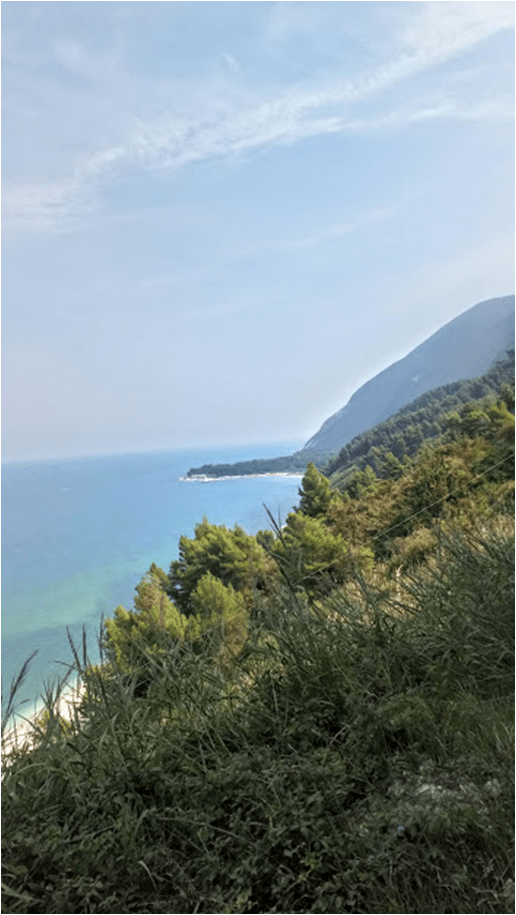
Same as last week – using colours that I recollect when remembering the memory of being in the place instead of the exact and complex (mixed) colours of the basic composition of the landscape, again painting using the blocking technique and simple shapes and lines >> in this case, I used temperature related colors to contrast each other as I vividly remember the cool shades of the beach and the sea when I’ve reached the beach after hiking down the slope and the hot temperature at the tope of the hill – the photo was taken in July
Colours used: coeruleum (light blue hue), viridian, yellow ochre and burnt sienna
Photo used:


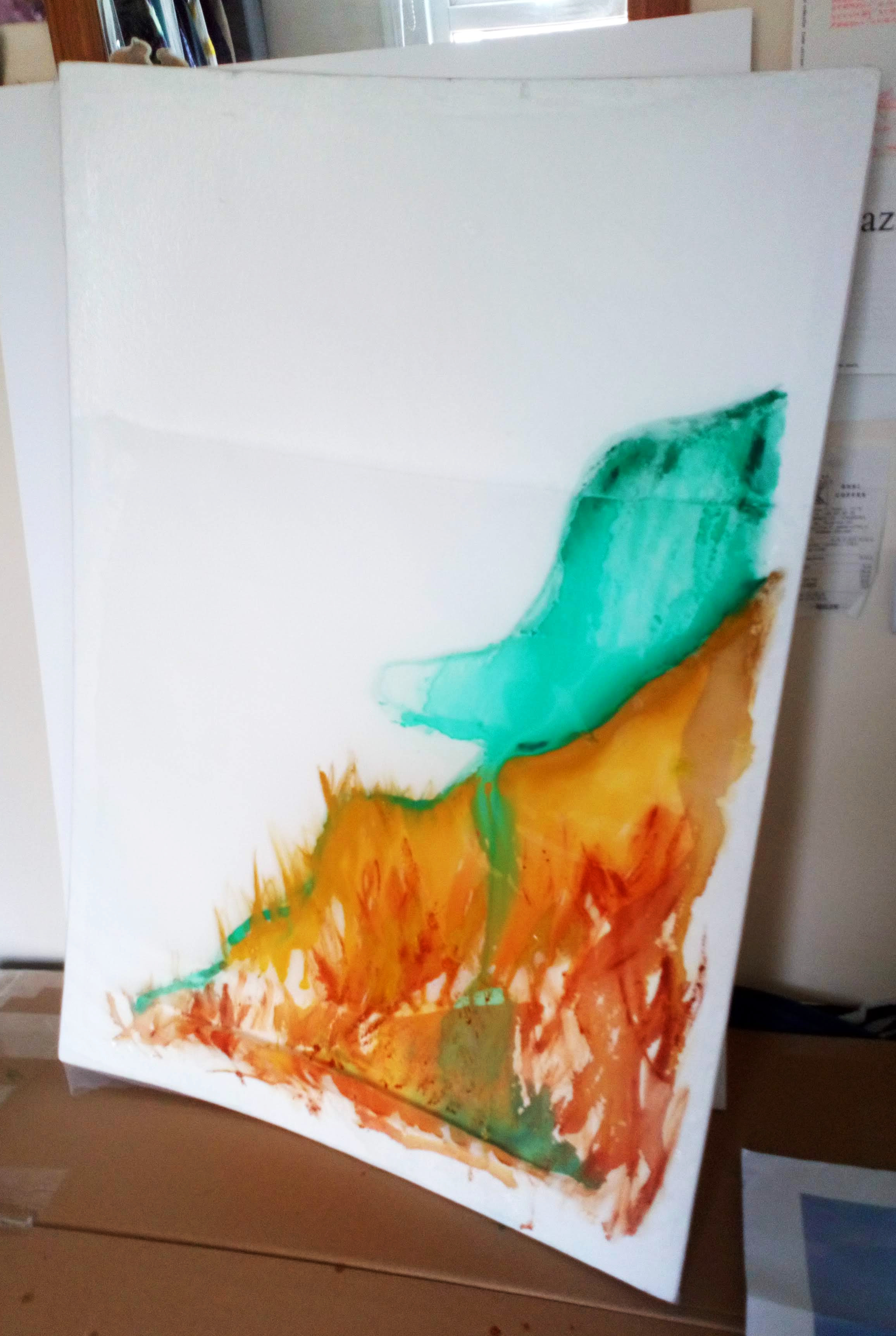

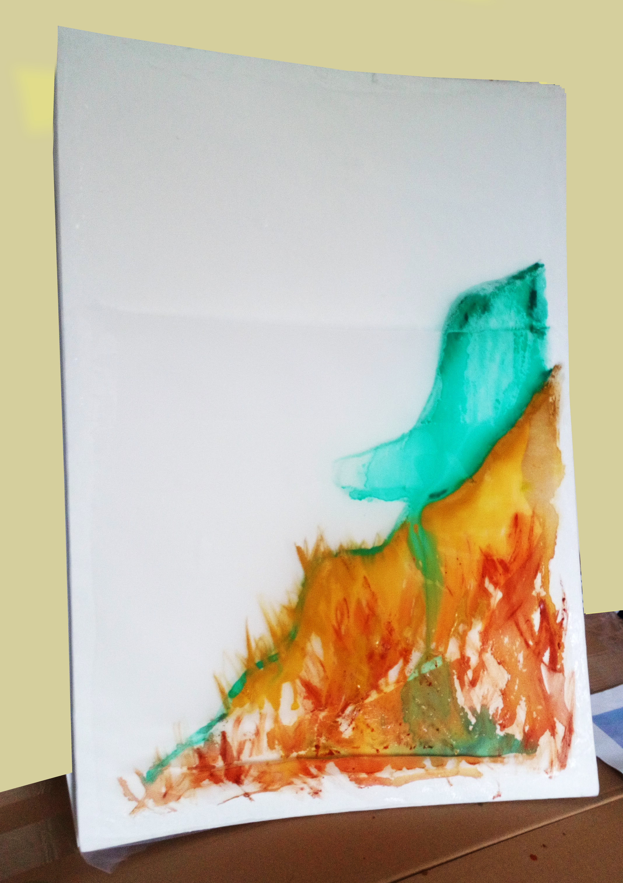


Next layer: add light blue hue to contrast the painting overall


Observations: when painting on this combination of surfaces – fabric, it is interesting to see the water droplet texture on the too layer of the fabric, with more water, the diluted watercolour drips down (according to the position of the painting) and sinks in/gets absorbed by the layers underneath
Because this foam board had an uneven layers of fabric applied, you can see different ways the paint interacts with the particular layer of the painting (type of fabric and number of fabric layers)


I think that this approach gives the viewer a unique perspective of seeing the process and a chance to understand the versatile characteristics of the medium (fabric and foamboard) as well as the types of paint itself (watercolour and water mixabled oil paints)
Academic tutorial – studio tutorial:
Artist suggestions: Ian Davenport, Ann Hamilton – process, pigment
Using clingfilm + paint as another layer and peel off, make 2 more paintings
