Important to experiment and consider the viewer’s perspective; experiment with display
– slightly different curve, paint using the other side
– using different lengths of fabric – overlapping?
-using layers to project the shift/movement; seperating the layers and moving them to create a sense of movement – animation >> could use transparent pva glue mixed with water to stretch/stiffen the particular layer (would have to cover the whole fabric and hand taut – or not – using folds in the fabric??)
– attaching paintings to create a more complex shape >> would be interesting and helpful in expressing the idea of emotions being complex in relation to mental disorders and communication within that, of emotions and about emotions – autism – – landscape of emotion, painting can be attached in a way of displaying imbalance; reference to nature too?
– sticking the fabric a bit differently: glue on both sides on both sides of the foamboard
Suggestion: keeping the layers together – the process can be seen especially in certain light and in the areas that I left unpainted; the area was left unpainted because of the rules of three colours used only and using lines to build structure – it gives interesting contrast with the drips of paint
Experimenting with the layers:
prospective – photos taken in week 11 during the lockdown, hence at home
Top left: all three layers, top right:two bottom layers, bottom: details of the texture
I like the way in which the different marks are vivid in both of the layer, the two top layers blocked too much and showing only the tulle layer is more effective to me
Top layer – experimenting with how the fabric reacts with light and the fact that the fabric allows the painting to be double-sided
Idea: considering using transparent/clear pva glue to stiffen the top layer and work with layers in an animation manner – to show shifts in landscape as representative of shifts of emotion and the magnitude of shifts can be suggestive of emotional balance or its lack + think about the benefits of double-sided painting, but mirrored inversed of course
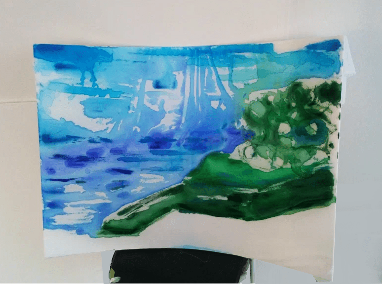
– Starting next (of the same photo, different format) painting
– Different position of painting
-Different type of paint: water- soluble oil paints, only water used to dilute
Colours used: ultramarine, phthalo
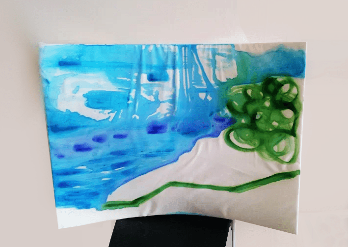
Dimensions: A1 (59.4 x 84.1 cm)
Similar painting process to the previous painting, but here, only one position was used to paint, which is a result of the previous experiment – the drips are a unique feature that draw attention
– Display idea; customary/temporary because it has to be made new for every exhibition (but the painting/artwork does not have to be made again – new)
– Finishing first painting and starting next (of the same photo, different format)
– Blocking and some wet on wet technique with watercolours with 3 colours only
Colours used: ultramarine, coeruleum and sap green
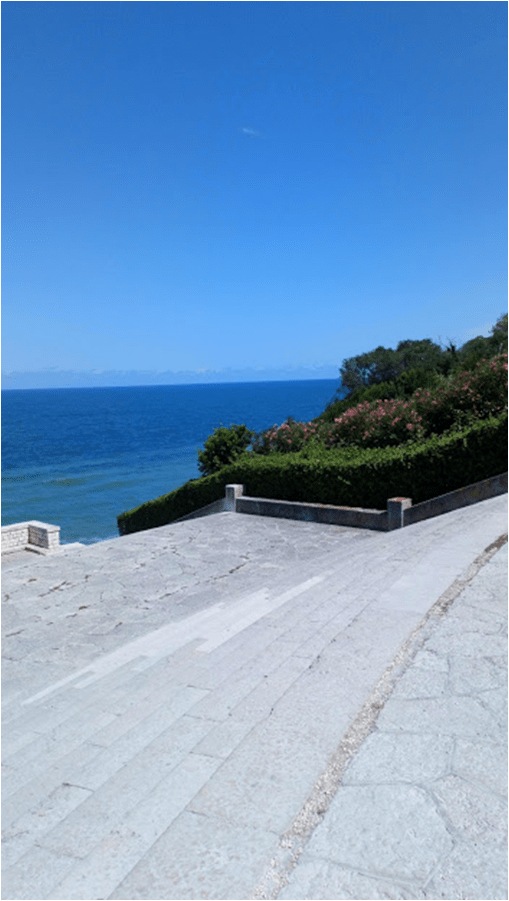
Photo used:
The painting process: I’ve used fast brushstrokes to create simple outlines of the parts of the lanscape and experimented with painting the sky and water part of the seascape – at first: painted laying down, which is visible in the drips moving towards the top of the painting – in the end, this results in an ineresting movement of the seascape
The middle layer (polyester fabric), when the top layer is taken off, A1 (59.4 x 84.1 cm)The top layer, on the reverse side The foamboard and the tulle fabric layer (bottom) , A1 (59.4 x 84.1 cm)Detail of the texture and paint layers
WEEK 5: Ideas and issues regarding the painting process
– rules: use 3 colours only, no white allowed
– first painting: paint from above, watercolours, very watered down?, more conceptual – thought out opposed to expressive (last approach); using shapes as direction of painting + simpler, to highlight the qualities/effect of the curved board
– use sponge?
– technical difficulties due to the curved board to consider
– top fabric not stretched perfectly; temporary (that’s the intention at least) ?
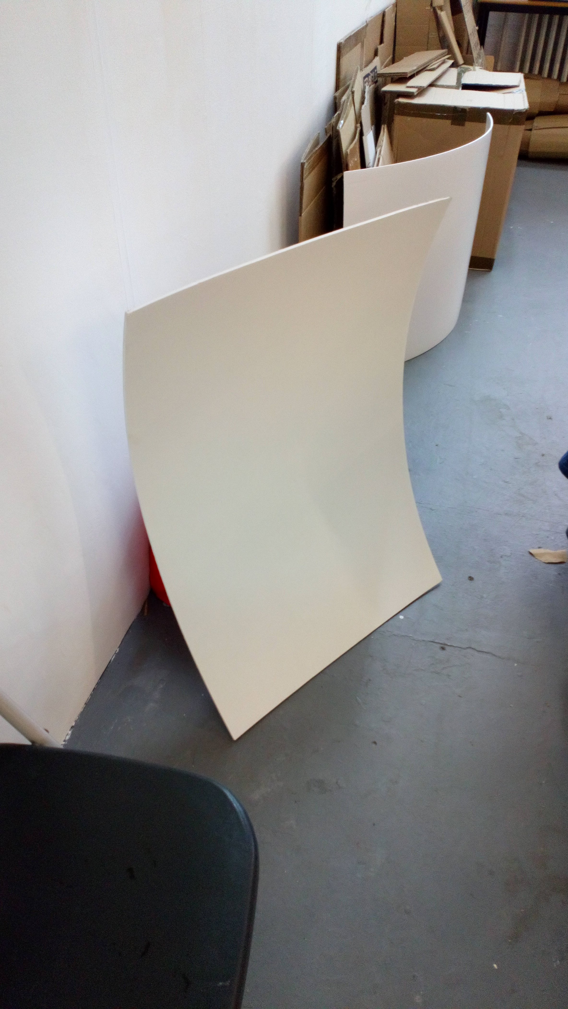
First, landscape, A1 (59.4 x 84.1 cm) painting base (foamboard with two layers of polyester fabric on top and tulle fabric from the bottom)
The fabric layers are attached using PVA glue – this allows me to peel off the layers if necessary/desired and does not damage/leave marks on the foam board – it is like the fabric becomes part of the the object – the curved foam board and together, produce a painting.
I’ve decided to use photographs as references for the composition and colour values, one landscape and one portrait orientated
Shape achieved by bending the foam board manually, with help of wet surface as the board is painted using emulsion paint, A1 (59.4 x 84.1 cm)
Here, it is an intentional process of manipulating the foam board as opposed to last term, when this happened unintentionally. I may experiment with different materials to use and how effective they are in allowing me to manipulate the shape.
Studio tutorial:Angus Wyatt
consider installation towards the end, painting as a process
possibilities: convex vs. concave shape of the board
think about installation throughout the process; the technicalities of display, i. e., fixed onto the wall
My approach here is more towards using paintings as a sculpture. This may be too complicated, which can result in receiving unclear messages and meaning of paintings as it reduces the paintings to a value of an object, perhaphs.
The artist’s initial intention for studio was to continue using similar mediums with emphasis on the use of the texture and movement of different types of fabric as a continuation from last year including summer project. The first artworks, two approximately A4 sized mix media (fabric, cardboard and oil pastels) pieces are regarding the ideas of transparency and translation which is somewhat related to the artist’s focus on fragility from last year. Nonetheless, there is less subjective connection of the artist to this work emotionally despite this piece’s strong connection to emotion being unable or difficult to express in regards to mental health, Autistic Spectrum Disorder specifically. Both qualities included in the title are shown using different mediums and types of fabric as well as using fabric as ‘the translator’ of words written on the fabric onto the cardboard. Two levels of transparency are being shown to represent both the difficulty of translating emotion into words and the direct manner of speaking the truth which is common for those within the autistic spectrum. Another artwork, present in the next post on the blog depicts the ideas of transparency using a previously used seascape theme.
Afterwards, the artist tested both primer and fabric stiffeners and found that emanel paint creates an interesting texture on grey card and PVA glue to be an effective fabric stiffener. The size and theme of paintings have not changed – B1 size and seascape photographs as my rough reference were used for the landscape expressive painting. Having started with firstly staining the fabric layers with thinned oil paint, added texture and expressive marks were added. Due to somewhat expected curved card (prior to previous test with primers) and faulty stretching of the fabric, additional texture was created by the folds in the fabric. This gave the artist the chance to play with the movement of the fabric and so, to capture that using two layers of thinned PVA glue which also added a ‘washed down’ feature to the experimental painting. The two layers of fabric resulted in being separate but also connected in the process. The top layer of the painting was separated and applied flat onto another B1 grey card. Preferred display of the paintings is presented in the photo at the top of the page. Post consultation, further work was done on the painting with the curved card as the medium by adding more abstract and bold in colour elements and paint mixed with PVA glue to produce some kind of idea of distinguishing layers and emphasizing the dimension of the painting.
At the beginning, the artist used references to art using language and Adam Pendleton can be used as a reference as he uses language in a raw and rough way onto the canvas. This is relevant because the mix media artworks strongly focus on the way of communicating emotions and lack of ability to express feelings – raw emotion. Consequent seascape transparent piece uses mark making and emphasis on texture which is also prominent in Oscar Murillo’s paintings. The ongoing B1 experimental painting process, which in conclusion resulted in two paintings, has developed reference points and meaning in the process. The PVA glue covered painting (top layer of the main process) shifted from being seen only as an expressive landscape onto potential environmentalist artwork. This is because of what could be interpreted as ironic and intended use of non-environment friendly materials trying to capture nature. Moreover, the use of PVA glue created a layer which reminds the artist of the washing down of the sea but also adds an almost a garbage like and unhealthy look to the landscape. This can be interpreted as environmental confrontation. Nonetheless, speaking of technique and the paintings itself, works of Helen Frankenthaler can be used to make a reference to the staining of the fabric and the abstract painting of the two. Texture is an important characteristic the artist focuses on and the work of Dušan Šimánek in their exhibition entitled Ticho II (Silence II) emphasises the same element of textiles. Lastly, the work of Yukari Kaihori can also be found applicable due to their exploration of material and technique of capturing textures and patterns.
There was an informal “Welcome Back” exhibition of works of students who just came back from Study Abroad and those who have joined our studio from the Erasmus+ programme. It is aimed to show a variety of things Studio 2i students got to do when studying abroad in different institutions.
Poster made by one of the Study Abroad students showcasing the different locations of Study Abroad students in the art department this year My lithography and digital posters I made in AAAD Prague, Czech Republic