Reflective Statement – Formative Assessment 2020

Reflective Statement – Formative Assessment 2020

The artist’s initial intention for studio was to continue using similar mediums with emphasis on the use of the texture and movement of different types of fabric as a continuation from last year including summer project. The first artworks, two approximately A4 sized mix media (fabric, cardboard and oil pastels) pieces are regarding the ideas of transparency and translation which is somewhat related to the artist’s focus on fragility from last year. Nonetheless, there is less subjective connection of the artist to this work emotionally despite this piece’s strong connection to emotion being unable or difficult to express in regards to mental health, Autistic Spectrum Disorder specifically. Both qualities included in the title are shown using different mediums and types of fabric as well as using fabric as ‘the translator’ of words written on the fabric onto the cardboard. Two levels of transparency are being shown to represent both the difficulty of translating emotion into words and the direct manner of speaking the truth which is common for those within the autistic spectrum. Another artwork, present in the next post on the blog depicts the ideas of transparency using a previously used seascape theme.

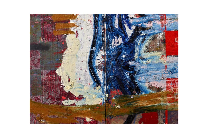
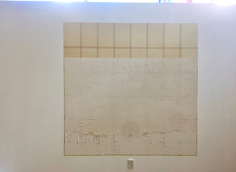
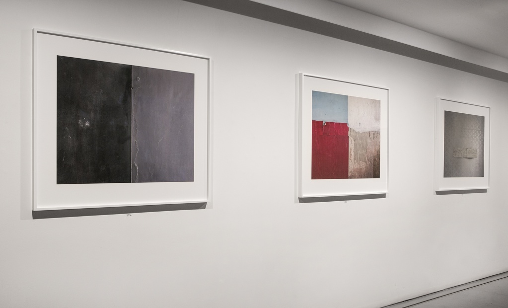
Afterwards, the artist tested both primer and fabric stiffeners and found that emanel paint creates an interesting texture on grey card and PVA glue to be an effective fabric stiffener. The size and theme of paintings have not changed – B1 size and seascape photographs as my rough reference were used for the landscape expressive painting. Having started with firstly staining the fabric layers with thinned oil paint, added texture and expressive marks were added. Due to somewhat expected curved card (prior to previous test with primers) and faulty stretching of the fabric, additional texture was created by the folds in the fabric. This gave the artist the chance to play with the movement of the fabric and so, to capture that using two layers of thinned PVA glue which also added a ‘washed down’ feature to the experimental painting. The two layers of fabric resulted in being separate but also connected in the process. The top layer of the painting was separated and applied flat onto another B1 grey card. Preferred display of the paintings is presented in the photo at the top of the page. Post consultation, further work was done on the painting with the curved card as the medium by adding more abstract and bold in colour elements and paint mixed with PVA glue to produce some kind of idea of distinguishing layers and emphasizing the dimension of the painting.  

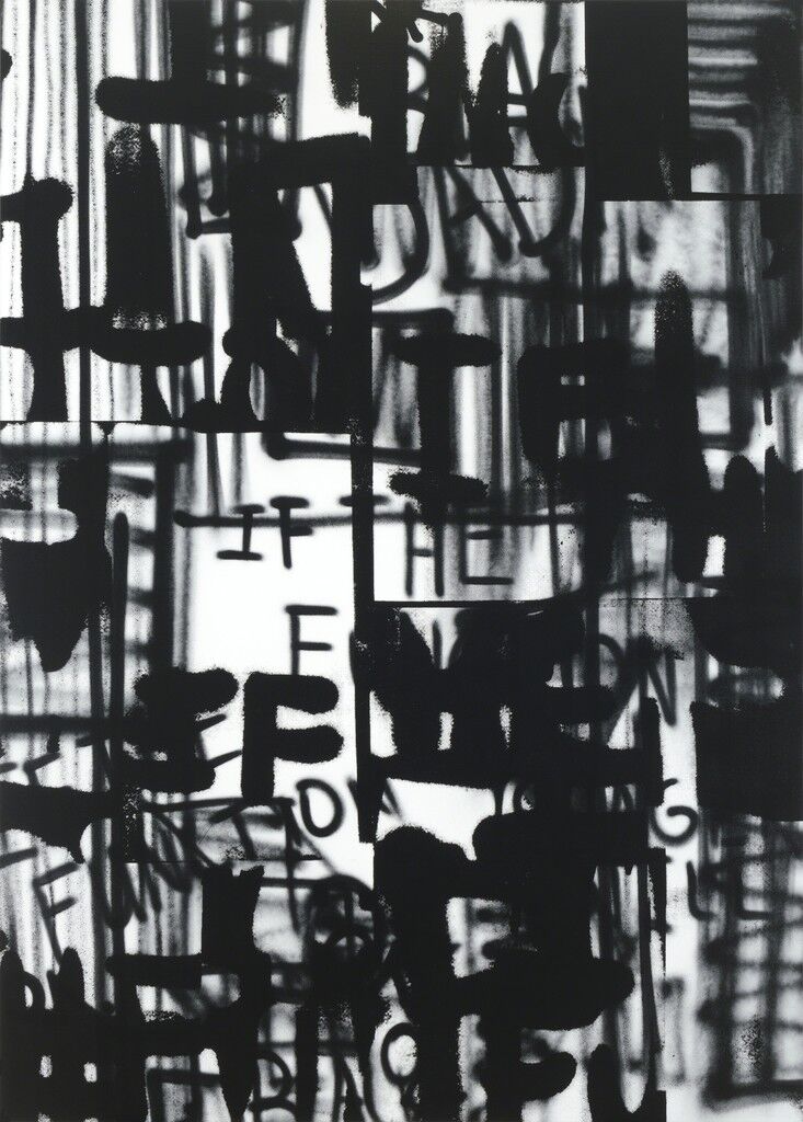
At the beginning, the artist used references to art using language and Adam Pendleton can be used as a reference as he uses language in a raw and rough way onto the canvas. This is relevant because the mix media artworks strongly focus on the way of communicating emotions and lack of ability to express feelings – raw emotion. Consequent seascape transparent piece uses mark making and emphasis on texture which is also prominent in Oscar Murillo’s paintings. The ongoing B1 experimental painting process, which in conclusion resulted in two paintings, has developed reference points and meaning in the process. The PVA glue covered painting (top layer of the main process) shifted from being seen only as an expressive landscape onto potential environmentalist artwork. This is because of what could be interpreted as ironic and intended use of non-environment friendly materials trying to capture nature. Moreover, the use of PVA glue created a layer which reminds the artist of the washing down of the sea but also adds an almost a garbage like and unhealthy look to the landscape. This can be interpreted as environmental confrontation. Nonetheless, speaking of technique and the paintings itself, works of Helen Frankenthaler can be used to make a reference to the staining of the fabric and the abstract painting of the two. Texture is an important characteristic the artist focuses on and the work of Dušan Šimánek in their exhibition entitled Ticho II (Silence II) emphasises the same element of textiles. Lastly, the work of Yukari Kaihori can also be found applicable due to their exploration of material and technique of capturing textures and patterns.

Word count: 698

Study Abroad Exhibition (16/01/2020)

Study Abroad Exhibition (16/01/2020)

There was an informal “Welcome Back” exhibition of works of students who just came back from Study Abroad and those who have joined our studio from the Erasmus+ programme. It is aimed to show a variety of things Studio 2i students got to do when studying abroad in different institutions.

Poster made by one of the Study Abroad students showcasing the different locations of Study Abroad students in the art department this year
My lithography and digital posters I made in AAAD Prague, Czech Republic
Intermedia Studio – Artist research and wide culture influences (continued project)

Intermedia Studio – Artist research and wide culture influences (continued project)

WEEK 3-4 :

  • Luxtorpeda – “Autystyczny” (Austistic) – English translation of chosen lyric:

“In the land of nowhere- nowhere entangled in myself

A bit selfish I sit and do nothing

The body is present, polite, and on the couch

The free spirit is breaking free and carousing together with the wind”

“Loving (me) and getting angry, you deal with it patiently

I also love you so much, just a little bit autistically”

  • Adam Pendleton: raw language onto canvas – relevant in context – using the power of language to express emotion and the lack of communication; here this artist can express lack of communication through their depiction of lanuage in a raw and untidy way
If the function of dada
If the function of dada, 2017
Galerie Laurent Strouk

WEEK 5-6:

Oscar Murillo (https://www.davidzwirner.com/artists/oscar-murillo)

  • emphasis on movement and pattern
  • focus on texture as important in paintings
  • use of the medium to create layers
Manifestation
Image result for oscar murillo manifestation
Manifestations (2019), David Zwirner gallery, London

WEEK 7-8:

experimental work: n/a

WEEK 9-10:

Yukari Kaihori (https://www.yukari-kaihori.com/)

  • focus on texture
  • emphasis on the materials and the relationship between two different materials, like in the artwork below
  • multi-medial work
Surface Space (2019), Kaolin on calligraphy paper, 2000mm x 2000mm, Elam Artists, Auckland, New Zealand

Dušan Šimánek (https://www.atelierjosefasudka.cz/cs/vystava/ticho-ii); capturing texture and properties of fabric/textile

Ticho II (Silence II) (2019), photographs, Ateliér Josefa Sudka, Prague, Czech Republic

WEEK 11-12:

Helen Frankenthaler (https://www.tate.org.uk/art/artists/helen-frankenthaler-1114)

  • abstract and bold
  • staining of the medium
  • patterns
[no title] (1997), Etching and aquatint on paper, Tate Department of Print

Intermedia studio – Week 11 and 12

Intermedia studio – Week 11 and 12

WEEK 11:

  • continue working with this painting
  • add one more layer of tulle fabric – complete this painting with abstract shapes and colours
  • using the same materials (water soluable oil paint, paintbrushes and palette knives

I thought it might me more successful if I continue painting with the board be on the floor so I paint from the above and add pva glue to paint to drop from above and make dents – dimension

WEEK 12:

STUDIO PLANS/IDEAS FOR SPRING TERM:

3D instalation of paintings which are bended in a way that they form a double helix shape – DNA, including a layer of tulle fabric stretched across to add dimension; representation of genetic preposition being something that is out of control of someone with mental illness – in relation to the aims of art therapy; expressing emotion, understanding emotion etc.

Additional Personal Project – Experimenting with print and graphic/digital design

Additional Personal Project – Experimenting with print and graphic/digital design

REALITY CHECK

I’d like to approach the idea of reality check in regards to two (different) points:

  • the absurds within Polish politics, with an example of one of the recent project/policy being voted on by the parliament to punish those who teach or even encourage about sexuality, gender, anticonception – in general, sexual education, which has strong connections to the fact that Poland is governed by Catholic principles as those are accepted – there are plenty of contravercies around the role of religion in Polish politics and currently, PIS, a right-wing party has the most power in the Polish government, especially after their victory in the most recent parliament election, giving them a majority in referendums etc. 

Lithography – Poster Designs

Poster Design no.1
Poster design no.2
Poster design no.3 – FINAL

EXPLANATION OF THE POSTER’S CONTENT:

“PiS’s take on sexual education” is a play on the phrase “piss-take” where the approach of PIS’s to sexual education in Poland is being brought to ridiculus quality, not even to mention that a lot of schools provide sex education performed by clarical figures, which leads to youth being uninformed and put under pressure of saving sex until marriage as the idea of virginity is thought to be sacred in Catholicism

Recently, PiS proposed a project that disables anyone to encourage or inform about sex education anyone under the age of 18, as there would be a maxium 3 year sentence punishment for such ‘activity’, this has a strong link to the party’s homophobic accusations, saying that homosexuals are pedophiles, therefore their explanation is that such prohibition of gender and sex related education is there to protect children and teenagers from potential dangers, including experimenting with sexuality and gender

> GRAPHIC DESIGN CLASS: references?

Drawing on the stone – ready for printing

PLAN: print on A3 paper and fabric – banner idea

One of the posters printed on an A3 200 g/m paper, before being put into press

REALITY CHECK – TIME FREEZE – photo series

  • a reality check I always experience when coming back to my childhood home, currently lived in only by my grandmother, as there are little changes, almost nothing different, everytime I come during the summer (at least), I experience a feeling of being frozen in time, which makes me nostalgic and comfortable but also concerned – this approach of “constancy” is common within my grandmother’s generation – a generation that grew up post- war, under communstic regime in Poland and I think that this might have some impact in this attitude of not changing, nonetheless, majority of elders in general seem to me to hold onto their past, regarding to ‘x’ time to be better than nowadays (…) 

I’d like to use the textures and patterns from these photos in a poster that explains what the anti- PiS poster is about as only people that are familiar current politics have a grasp of the situation and this specific issue, as they are representative of the past that is still current in Poland, suggestive of time-freeze and in this case, regression!

Informative posters:

Informative poster #1
Informative Poster #2
Informative poster #3

I will also provide necessary translation when showing these posters in studio, in Prague, especially explaining the slang word ‘piss-take’ and its importance in the way I used it for this project

Expected size of posters: A3 on poster paper

DISPLAY:

FEEDBACK:

  • font: not serious, may not be take seriously which may impact how the issue that I’m representing on my poster is taken – risky?, also this may be seen as unrespectable to the place the poster would be shown in as it would be on the public grounds, but of property of someone too – land/wall/building etc. , the poster with white font was perceived to be more effective because of the high contrast between the colour of the text and background
  • size: A3 is not big enough to be impactful and respected in the public space
  • graphic design – primitive: could be effective, frequently used in propaganda posters?
  • idea: could make artwork like this relating to the British politics – the situation is a bit similar as far- right wing party are in control too and have been for some time also (for less time in Poland) + reality check – time freeze – generation difference as to ‘when it was better’ can be further explored ??
  • ARTIST INSPIRATION: Wolfgang Tilleman (photographer); their work could also apply to my studio art practice
  • LITHOGRAPHY PRINT: the prints on plastic sheet(s) and paper have been relatively successful (bold print) but not as bold on fabric >> screenprinting may be considered if project continued further; paint>charcoal, could have tried making this print using paint/ink opposed to charcoal – lots to experiment/test out!
Intermedia studio – Week 9 and 10

Intermedia studio – Week 9 and 10

WEEK 9:

Painting progress:

  • use pva glue to play with the movement of the painting and stick onto another cardboard – like in the photo > different approach due to different order of fabrics used
  • expressive landscape – also experimental

Ideas: disturbance

Experimenting with texture:

Using pva mixed with water to stiffen fabric, while the oil painting in still wet – experimental

DISPLAY IDEAS:

  • display all components seperately, as paintings, on the wall, no mounting – banner idea?
  • 2 x 2 washing lines to stretch all components, cardboard on the wall

WEEK 10:

Second layer of PVA glue (on a board)
Video of close ups

After having a look at the effect of PVA glue on the fabric and the painting, I was interested about the way it ‘shuts down’ the textural qualities of oil paint and a different perspective came to my mind – this painting/art piece may be interpreted as an environmental confrontation, a climate change commentary

This is because:

  • at first glance, the pva glue, before drying (as on the photo above) can resemble water foam – symbolic of a natural instability ?? but this layer of pva glue can be also interpreted as a ‘wash down’ / backwash of a wave, which is interesting because it is created using a synthetic, polymer solution – plastic, which in fact is being washed down in oceans as pollution
  • in addition, the fact that I used oil paint could be considered as another layer of the ridicule – both oil and plastic pollution are a big cause of climate change but this is especially interesting as I used water- soluble oil paints, which provides a direct ‘joke’/ message
  • the layer of fabric, which in fact is also made up of synthetic material, creates a topographic/wave like texture, also with no gloss, no live – this piece could be seen a warning of the future ‘synthetic landscape’
  • the ‘backbone’ of the painting/piece is a paper recycled (?) board – the use of this material may also be problematic as it’s considered to be more eco-friendly compared to plastic, but should be thoughtfully used considering the burning Amazon and the general over- cutting of trees
  • the process which I made this piece may give more insight to the meaning that has emerged from the experimental process regarding materials/materiality – emotional and expressive, with initial theme of instability, translations and transitions, is an overall picture of my idea of showing complexity in general >> in this case, this is the complexity of the environmental crisis and emotional crisis and the struggle of ‘translating’ these, as in fact, climate change has been an overlooked problem/issue for years and only now, people, especially youth and young adults are acting

To summerise: I started this experiment with an emotional and expressive approach, which turned into an represenation of a climate/environmental crisis

Consultation:

– more is needed, to see continuation (5 more paintings/pieces perhaps) of the experiments, working with coincidences, teacher interested in the more 3D abstract painting, with fragile/delicate textures, abstract dimensional painting – ugly (progressive? weird?), don’t use natural colours

– scale: plan to bigger or work with different types of fabric, use something else instead of the paper board, material: foam board?

– context: more astract different context to be considered

– Artist: Katharina Grosse @ National Gallery Prague https://www.ngprague.cz/en/exposition-detail/katharina-grosse-wunderbild/

Intermedia studio – Week 7 and 8

Intermedia studio – Week 7 and 8

WEEK 7:

– testing hairspray as a stiffing medium for the chosen fabric (silky polyester fabric and tulle fabric) >> comparison with pva (similar/same size) to see which better conveys […] >> another idea – using a fabric stiffener spray or a natural fabric stiffener (need to experiment with)

Hairspray:

PVA glue:

DISPLAY IDEA: PROTEST BANNER IDEOLOGY:

  • using 2 pieces of wood (sticks?) to (possibly) stretch the fabric layer(s) of fabric when after applying pva glue in order to stiffen and ‘capture’ textures and movement of the fabric
  • ideology used to express emotional values of instability within the painting in reference to anxiety and personality disorders, through indirect/silent ‘protest’ – the viewer might not be interested in the piece due to the implicity of meaning of the piece, but perhaps this could be something that makes the viewer wonder about the artist’s intentions*
  • perhaps I could consider not using pva glue if taking this ideology further, this may also depend on display

* this should be further discussed, perhaps supporting material will be needed

> playing with the language word play: banner (en) > transparent (pl)

WEEK 8:

3 primer options – emanel paint, paint+pva glue and just pva glue

I’ve chosen the emanel paint as the primer – texture is the most interesting

CLOSE UPS:

Cardboard:

Satin fabric:

Tulle fabric:

As you can see, there are slight differences on the cardboard because that’s where the medium/primer is applied

Now I want to experiment with the number of fabric layers, I have switched the order in this I layer the fabrics: now, the tulle fabric at the bottom, silky fabric at the top*

* this order may be benefiticial for me as it is easier to apply paint on a smoother surface which the tulle fabric does not quite provide

> display idea : unconventional stretcher, protest banner idea, pva glue to stiffen fabric

Intermedia studio – Week 5 and 6

Intermedia studio – Week 5 and 6

WEEK 5:

  • testing different (sheer) fabric

To consider: adding depth to the layers by using PVA glue to ‘solidify’ the fabric layer – may create a sense of movement in the painting >> instability look at a post “Experiments” from Summer Project for reference (photographic)

>> plan to go bigger? + oil painting + watercolour board to absorb the paint more efficiently? or use the same grey cardboard but with a layer of gesso (as base)idea for display: similar to demonstration banners – demonstration/protest/exposing of own feelings/ emotional instability – in reference to various mental disorders – performative use?[consider display + using the fabric layer as a ‘sculpture’]

WEEK 6:
larger scale >> test out different primer options when using a grey board: acrylic paint vs. pva glue vs. acrylic paint+ pva glue mixed >> oil paint opposed to oil pastels as they are more effective in a way of depicting the idea of translation; blending, textures etc. >> layering two fabrics (tulle and polyester)

Studio of Intermedia Confrontation – continuous art practice (Week 3 – 4 of Autumn semester)

Studio of Intermedia Confrontation – continuous art practice (Week 3 – 4 of Autumn semester)

WEEK 3:
IDEAS:

– continuing (from last year) using same kind of fabric (sheer, transparent) but in relation to a slightly different topic relating to materiality and semantics/theme — Transparency/ Translation (topic with diverse references to current issues and other topics and themes)

TRANSPARENCY: still working with layers*

– addition of text- as relevant to translation and communication, translation is particular could be particularly interesting when using text and the translation of emotion onto art medium (which is highly relevant to art and art therapy – emotive language)

– focus on language and the way language is used as a medium of communication and translation of inner thoughts and feelings

* of different characterics – similar to oil pain stains on A3 paper from last year


EXPERIMENT:


IDEAS behind this experimental piece: Issue: communication in autistic spectrum disorder (ASD) – lyrics of “Autystyczny” (original in Polish) by Luxtorpeda* – paritular part of lyrics used to represent the two-sided issue of communication within families dealing with autistic spectrum disorder, this regards both literal communication and emotional issues – the colour of blue has been chosen to be paired up with white as it is not only easy to read, but blue is also the colour of autism – both transparency and lack of transparency are shown –> first piece shows transparency hence sheer fabric used and the secondary outcome (‘translation’) and the text relates to the emotional struggles of someone with ASD, whereas the second was done on a non-transparent fabric resulting in only one outcome, relevant to the text, which is talking about the natural, direct emotional bond between a child with ASD and a family member, especially the mother — if to further explore ASD communication, synaethesthesia could be considered (seeing numbers as colours etc.) as this condition is common in children with ASD

* more info under WEEK 4

WEEK 4:

I’ve decided to accompany this piece with literal direct translation of the text, which is something to consider and discuss as the reason behind is that I wanted to show another aspect of translation that everybody to relate  to the language to language translation and this issue is particularly key for me now being on a study abroad in Prague (Czech Republic) – this expands the idea of ideas being ‘lost in translation’ which is something I’d like to further explore, perhaps in larger scale and with reference to DADA art movement (different meaning of the same word in different languages)

MEDIUM: at the moment, I’d like to focus on 2D aspect of my work, afterwards I may consider spatial location of my pieces or even installation as sculpture or having 3D parts on a 2D installation/painting

Venice Biennale 2019 – Artist Inspiration

Venice Biennale 2019 – Artist Inspiration

While studying in AAAD in Prague, I got the chance to go on a trip to Venice for the Venice Biennale. Having seen a lot of art in Venice Biennale, I’d like to highlight some of artists and artworks that can be relevant to my practice or in my future art practice (found interesting) :

COUNTRIES:

  1. Czech Republic and Slovak Republic (https://www.labiennale.org/en/art/2019/national-participations/czech-republic-and-slovak-republic)
  2. Ireland (https://www.labiennale.org/en/art/2019/national-participations/ireland)
  3. Grand Duchy of Luxembourg () https://www.labiennale.org/en/art/2019/national-participations/grand-duchy-luxembourg
  4. Madagascar (https://www.labiennale.org/en/art/2019/national-participations/madagascar)
  5. Nordic countries (Finland, Norway and Sweden) (https://www.labiennale.org/en/art/2019/national-participations/nordic-countries-finland-norway-sweden)
  6. The Netherlands (https://www.labiennale.org/en/art/2019/national-participations/netherlands)
  7. Peru (https://www.labiennale.org/en/art/2019/national-participations/peru)
  8. Poland (https://www.labiennale.org/en/art/2019/national-participations/poland)
  9. Portugal (https://www.labiennale.org/en/art/2019/national-participations/portugal)
  10. Saudi Arabia (https://www.labiennale.org/en/art/2019/national-participations/saudi-arabia)

Collateral and Artists: