1st foamboard – small modifications to the shape (small curve), fabric applied on the reversed side opposed to previous paintings, order of fabric applied reversed (bottom layer – thin polyester white fabric, two top layers – white tulle) + using the concave side of the foam board to paint on
2nd foamboard (bottom layer – thin polyester white fabric, two top layers – white tulle), only slight modifications (small curves)
Important to experiment and consider the viewer’s perspective; experiment with display
– slightly different curve, paint using the other side
– using different lengths of fabric – overlapping?
-using layers to project the shift/movement; seperating the layers and moving them to create a sense of movement – animation >> could use transparent pva glue mixed with water to stretch/stiffen the particular layer (would have to cover the whole fabric and hand taut – or not – using folds in the fabric??)
– attaching paintings to create a more complex shape >> would be interesting and helpful in expressing the idea of emotions being complex in relation to mental disorders and communication within that, of emotions and about emotions – autism – – landscape of emotion, painting can be attached in a way of displaying imbalance; reference to nature too?
– sticking the fabric a bit differently: glue on both sides on both sides of the foamboard
Suggestion: keeping the layers together – the process can be seen especially in certain light and in the areas that I left unpainted; the area was left unpainted because of the rules of three colours used only and using lines to build structure – it gives interesting contrast with the drips of paint
Experimenting with the layers:
prospective – photos taken in week 11 during the lockdown, hence at home
Top left: all three layers, top right:two bottom layers, bottom: details of the texture
I like the way in which the different marks are vivid in both of the layer, the two top layers blocked too much and showing only the tulle layer is more effective to me
Top layer – experimenting with how the fabric reacts with light and the fact that the fabric allows the painting to be double-sided
Idea: considering using transparent/clear pva glue to stiffen the top layer and work with layers in an animation manner – to show shifts in landscape as representative of shifts of emotion and the magnitude of shifts can be suggestive of emotional balance or its lack + think about the benefits of double-sided painting, but mirrored inversed of course
most animation: 8-10 fps (but playing at 25 fps – video) for smooth transitions
– stills
– Copydesk
It’s such a beautiful day (2012)
William Kentridge – charcoal
Jan Svankmajer: experimental/surrealist
Brothers Quay
SketchUp
Blender
Premier
Animation kits
drawings – copyset – kits to make? >> registration – – > in the AV studio
Cel Animation concepts (layers) – using frame
I’ve decided to get to know the basics of animation because I am considering using somewhat of an animation using painting of seascapes.I’d like to show the motion of waves in a more real, but kind of a poetic way as I am drawing reference from my own memories. In addition, I am considering using sound/music to enhance the experience of being within the seascape, not just watching the sea. I could use the layers of fabric as each new movement of the animation – see Summer term, Week 2 notes from the tutorial for more.
– Starting next (of the same photo, different format) painting
– Different position of painting
-Different type of paint: water- soluble oil paints, only water used to dilute
Colours used: ultramarine, phthalo
Dimensions: A1 (59.4 x 84.1 cm)
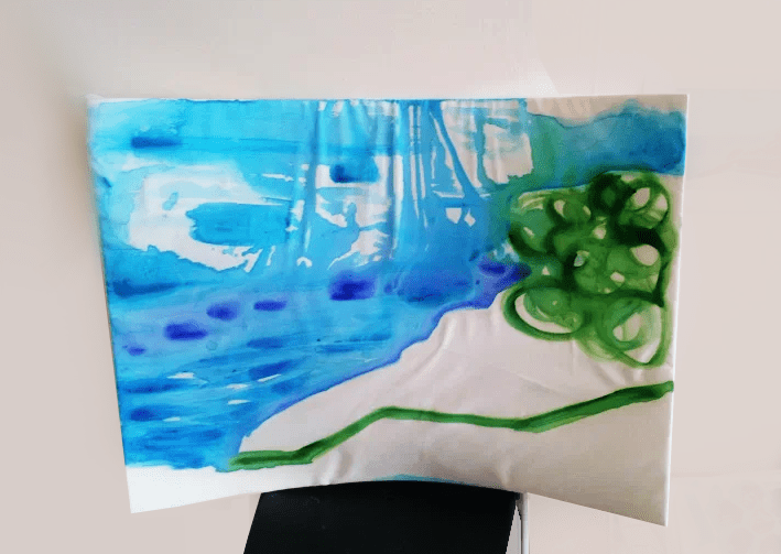
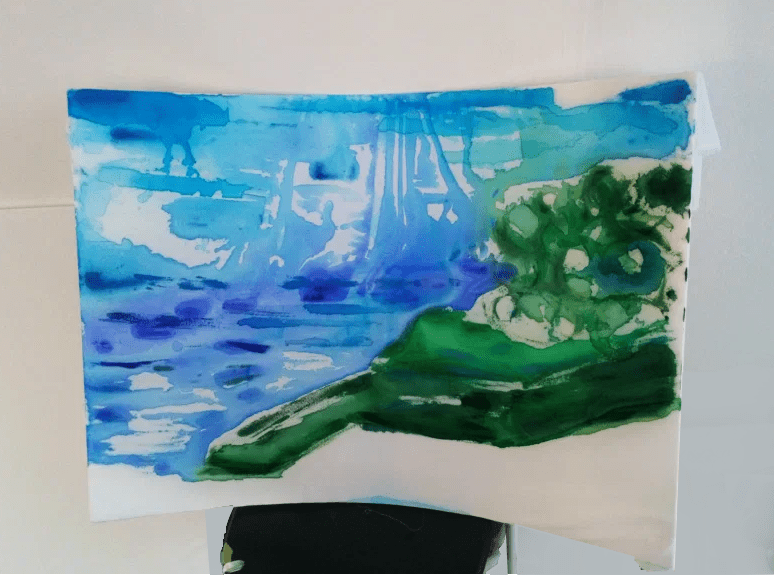
Similar painting process to the previous painting, but here, only one position was used to paint, which is a result of the previous experiment – the drips are a unique feature that draw attention
– Display idea; customary/temporary because it has to be made new for every exhibition (but the painting/artwork does not have to be made again – new)
– Finishing first painting and starting next (of the same photo, different format)
– Blocking and some wet on wet technique with watercolours with 3 colours only
Colours used: ultramarine, coeruleum and sap green
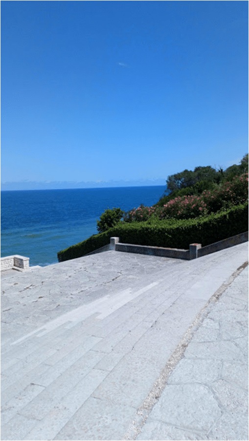
Photo used:
The painting process: I’ve used fast brushstrokes to create simple outlines of the parts of the lanscape and experimented with painting the sky and water part of the seascape – at first: painted laying down, which is visible in the drips moving towards the top of the painting – in the end, this results in an ineresting movement of the seascape
The middle layer (polyester fabric), when the top layer is taken off, A1 (59.4 x 84.1 cm)The top layer, on the reverse side The foamboard and the tulle fabric layer (bottom) , A1 (59.4 x 84.1 cm)Detail of the texture and paint layers
Somerset House – Mushrooms: The Art, Design and Future of Fungi
Somerset House – Gallery 31 (New Wing) – I should be doing something else right now
Wellcome Collection
Reflection: The exhibition about mushrooms was really versatile and invocative. It provided me with an understanding of the subject of the exhibition and gave me further interest to perhaps come back to this topic area.
WEEK 5: Ideas and issues regarding the painting process
– rules: use 3 colours only, no white allowed
– first painting: paint from above, watercolours, very watered down?, more conceptual – thought out opposed to expressive (last approach); using shapes as direction of painting + simpler, to highlight the qualities/effect of the curved board
– use sponge?
– technical difficulties due to the curved board to consider
– top fabric not stretched perfectly; temporary (that’s the intention at least) ?
First, landscape, A1 (59.4 x 84.1 cm) painting base (foamboard with two layers of polyester fabric on top and tulle fabric from the bottom)
The fabric layers are attached using PVA glue – this allows me to peel off the layers if necessary/desired and does not damage/leave marks on the foam board – it is like the fabric becomes part of the the object – the curved foam board and together, produce a painting.
I’ve decided to use photographs as references for the composition and colour values, one landscape and one portrait orientated
Itchy Archive – in the centre: artist book – audio, looks like a book – irritation due to allergens being embedded in the pages of the book >> epidermal irritation
Chapter 1: Rules and regulations – health and safety – yes/no >> object based out in dialogue with poetry >> archive
Chapter 2: History – 1603: noun – conservation – perservation, in 1934 transitoned to a verb >> cluster of words
Reading: theory – Foucault’s “The Archeology of Knowledge and The Discourse on Language”
Wunderkammer – “Cabinet of Curiosities” – consistency? – no consistency >> cluster of words [reference]
Susan Hiller – “From the Freud Museum” (1991-6) >> Lost Souls – in the house
Reflection from the talk:
I think that the area of the artist’s interest is very intriguing. I find it fascinating how immersive and intrusive the artowork is. This makes me more motivated and interested in focusing on the audience’s experience of my work.